
Good unbiased data on the recent growth of renewables in the U.S. can be difficult to find. One helpful option is the Energy Information Administration (EIA), which puts out monthly generation figures for all energy technologies. Its most recent release included December 2010, giving us a chance to aggregate 2010 data, and compare back a few years. Generally, EIA is the most reliable source for this kind of data, and while they’ll usually do a few revisions, this shouldn’t affect the numbers below greatly. So in case useful, I've put together some data points and charts from EIA’s monthly energy review.
(It’s likely that at this point in the post, our comms director has thrown up his hands and given up on me ever blogging on something of interest to more than 14 energy nerds)
(and also, on a serious note, I would be remiss if I didn’t point out here that the EIA as an institution stands to suffer serious near-term damage from recent budget cuts imposed in DOE through the FY11 Continuing Resolution. You can get more info on the impacts here, here and here – and my broader frustration with the C.R. here – but suffice it to say, these cuts have a serious real world impact. Just to name a few examples, oil and gas traders and investors use EIA data in a range of analysis, including physical storage, reserves, energy demand, and pricing; policymakers rely on EIA for energy forecasts and trends and analysis of policy impacts; and energy researchers rely on crucial NEMS model runs. Many of these programs will be temporarily halted due to the $15 million in budget cuts to EIA, and that's a bad thing for our economy and the energy industry. And now back to the data…)
Among the highlights from EIA's data:
- The growth of renewables, as measured by power generation, especially in relation to net U.S. power generation, is impressive. We’ve still got a loooong way to go before we can claim a transformation to a clean energy economy, but there’s a lot to be optimistic about, especially given that the energy sector isn’t typically prone to the kind of explosive growth, or overnight adoption of transformative technologies, that we see in other sectors
- Wind power has been primarily responsible for the expanding renewables share. Solar has also seen impressive growth, but off a much smaller base.
- Overall, there’s been a good deal of fuel switching from coal in the past few years, mostly to renewables (primarily wind and hydro) and natural gas.
Total non-hydro renewables (all renewables except hydro power) now amounts to 4% of net U.S. electricity generation - a four year doubling. This can be graphed a number of ways, but I find the year-over-year comparisons to be most useful in picking up the trends. The big variation month-to-month the past couple years is due to wind generation quirks (as wind gen tends to peak in Spring and Fall, but tails off during the Summer). Depending on the month, one can say that non-hydro renewables account for up to 5% of total generation, a significant improvement in just a few years. But for the full year, renewables provided 4.1% of total U.S. electricity generation in 2010.
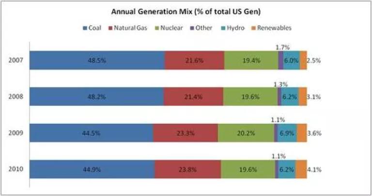
Annual generation mix still fossil fuel dominated, but seeing fuel switching from coal to natural gas and renewables. Just as a reality check, it is still worth noting how much further we have to go. Renewables, even including hydro power, still represent a small fraction of total generation. The past 4 years have seen some fairly significant fuel switching from coal, but natural gas has taken a greater share than renewables. (and on a separate note, not shown here, but based on preliminary 2010 data, total generation levels appears to have recovered from its 4% drop from 2009, but are still 1% below 2007 levels).
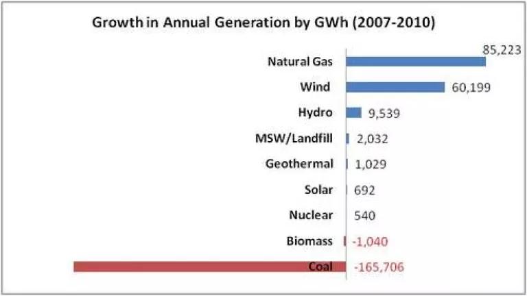
Another way to look at this trend, is to compare the change in generation amounts by specific energy technology, both in percentage and actual terms. To some extent, choosing 2007 is an arbitrary decision (for example, 2006 would show an even greater jump in natural gas, hydro and nuclear, and slightly less coal switching) but the overall pattern holds going back for several years prior. However, its helpful to distinguish between actual generation amount (gigawatt hours or GWh), and growth rate - while wind and solar dominate from the perspective of the latter, natural gas has actually seen the most aggregate growth in generation since 2007.

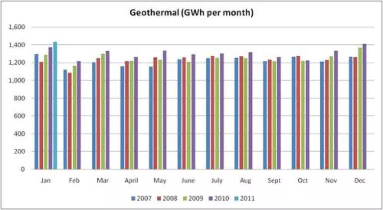
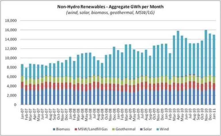
Non-hydro renewables growth over the past 4 years primarily led by wind. Looking at aggregate growth of non-hydro renewables generation month to month over the past four years, aside from a few minor month-to-month deviations, wind is responsible for essentially all of the incremental growth in renewable generation we’ve seen since 2007. While solar has grown significantly, it's been off a small base, and geothermal, biomass and MSW/landfill gas generation has all stayed constant.
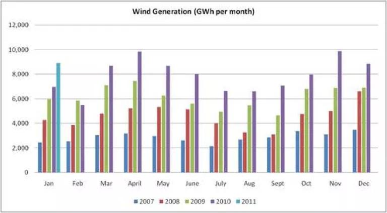
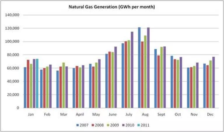
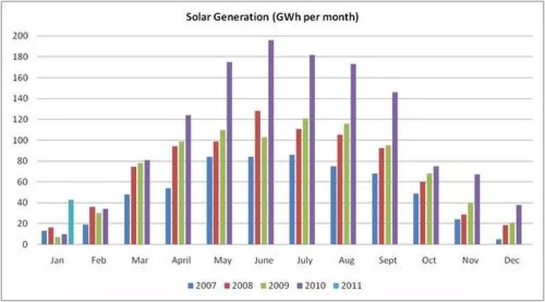
Wind, Natural Gas and Solar generation per month – the growth in wind has been impressive over the past four years, (seen below on a month to month basis). On an annualized basis – total wind generation in 2010 was responsible for 2.3% of all generation and was 60,000 GWh higher in 2010 than in 2007. This was second only to the growth in natural gas generation (which provided 85,000 GWh more generation in 2010 than in 2007). Solar growth has certainly been impressive, but even on its best month (and wind’s worst month), it only provides 3% of the power that wind does. I only add geothermal because, after 4 years of sameness, we may, finally, be seeing a bit of growth in generation from this important baseload renewable power source.