
Mapping Urban Heat Islands Is Helping These Neighborhoods Adapt
The Urban Heat Island mapping campaign is the largest national effort of its kind to identify why one section of a city can feel so different from another on any given summer day.

Temperatures reached 118 degrees Fahrenheit during a record heat wave in Phoenix on July 18, 2023.
Patrick T. Fallon/AFP via Getty Images

Residents of Raleigh and Durham had plenty of experience with sweltering summers in central North Carolina. But they also understood that what was merely hot in one part of town could be unbearably hot in another. The question was, where exactly was extreme heat hitting people the hardest, and what could be done about it?
So in the summer of 2021, a group of more than 250 volunteers in the two cities got together. Over the course of a hot July day, they attached portable heat and humidity sensors to their cars and bikes, then took to the streets to look for answers.
Urban heat island:
An area with high concentrations of heat-absorbing buildings, roads, and parking lots, with limited trees and green spaces, which can get as much as 20 degrees Fahrenheit hotter than nearby areas.
These community scientists were participants in the Urban Heat Island (UHI) mapping campaign. It’s an initiative funded by the National Oceanic and Atmospheric Administration (NOAA) and led by the climate-focused data analytics and consulting group CAPA Strategies, which collects hyperlocal heat data to better understand disparities and vulnerabilities to heat exposure within cities. Now in its seventh year, it’s the country’s largest and most granular effort of its kind to identify what are known as “urban heat islands.” And the work is increasingly urgent, given new findings that about 41 million people in the United States are living in urban zones where temperatures are at least 8 degrees Fahrenheit warmer than surrounding, less developed areas.
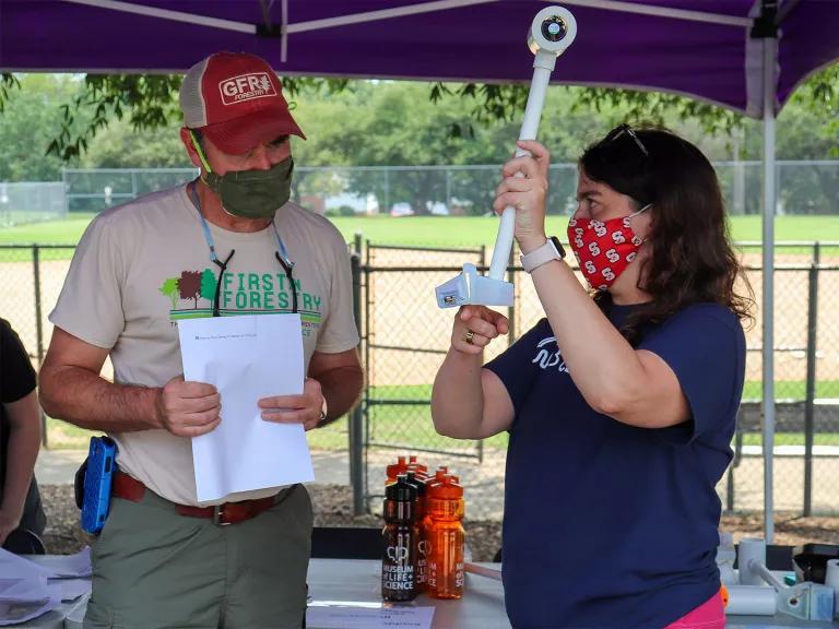
A demonstration of thermal car sensors at an urban heat mapping event for volunteers at John Chavis Memorial Park in Raleigh, North Carolina, in October 2021
CAPA Heat Watch
In Raleigh and Durham, the 2021 heat mapping project yielded nearly 100,000 individual data points along 19 routes. While the temperature reached nearly 90 degrees Fahrenheit in both cities, there was a 9.6-degree difference between the hottest and coolest areas of Raleigh and a 10.4-degree difference in Durham. Variances like these are the result of a legacy of discriminatory policymaking decisions, including a history of redlining, which labeled communities of color as hazardous zones unworthy of investment. Such environmental racism influenced where green spaces like parks as well as infrastructure like highways and industrial facilities have been built, explains Max Cawley, the director of climate research and engagement at the Museum of Life and Science in Durham and an organizer for the campaign. “We know that heat expression across an urban environment is not equal or equitable,” he says, “and today, we see those painful decisions of the past playing out as climate vulnerability.”
Durham’s former Hayti district, for example, was once the cultural and economic center of the city’s Black community. But in the 1960s, the district was effectively demolished under the guise of an “urban renewable” project that built North Carolina Highway 147 directly through Hayti’s center, displacing families and businesses. The pavement-dense area now experiences severe heat more frequently than leafier nearby neighborhoods.
By working with communities to better identify particularly heat-vulnerable spots like this one, the Urban Heat Island mapping campaign can provide lawmakers and local advocates with data for equitable solutions to keep the most at-risk residents safe.
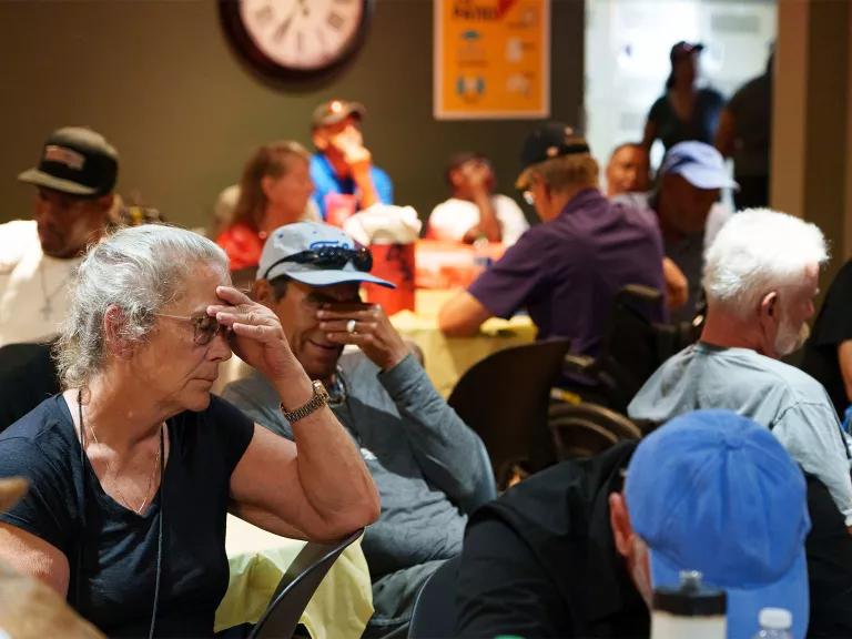
The Justa Center, one of many cooling centers in Phoenix during a heat wave, on July 16, 2023
Megan Mendoza/The Republic/USA TODAY NETWORK
Learn More: Extreme Heat


The need for urban heat island mapping
To date, the mapping campaign has collected data in more than 60 cities across the country. This summer, another 18 communities across 14 states, as well as Santiago, Chile, are gearing up to participate. The work is more critical than ever, as extreme heat in the United States remains responsible for the largest number of weather-related deaths each year, and every additional degree during a heat wave increases mortality by nearly 2.5 percent. Beyond health risks like respiratory and heart issues, extreme heat also causes expensive losses in worker productivity, missed school days, and damage to infrastructure. And these impacts disproportionately fall on low-income communities and communities of color.
Given these facts, the heat mapping campaign was a natural fit for the Biden administration’s Justice40 initiative, which works to ensure that 40 percent of federal investments in climate and clean energy go toward disadvantaged communities that are marginalized, underserved, and overburdened by climate issues like urban heat islands. As part of Justice40, the Urban Heat Island mapping team gave significant weight to city applications with a serious commitment to addressing environmental justice. And during this year’s mapping campaign, participants will track the allocation of benefits to those communities.
Many of the cities selected for 2023 are already grappling with the urgent need to adapt to various climate impacts that are cropping up with increasing frequency. This includes extreme weather events that destroy natural infrastructure (like trees), which in turn leaves a city more vulnerable to extreme heat.
In Iowa City and Cedar Rapids, Iowa, an intense windstorm in 2020 took out tens of thousands of trees as part of what became the costliest thunderstorm in U.S. history, greatly reducing the region’s shade-providing canopy. An ice storm hit Oklahoma City that same year, also damaging as much as 90 percent of the tree canopy across the city’s parks. And in Oregon’s Portland metro area, a once-in-10,000-year heat dome in June of 2021 led to three consecutive 100-plus degree days, shattering records and leading to nearly 100 deaths across the state.
“We already know that climate change is increasing the frequency, intensity, and duration of heat waves,” says Adelle Monteblanco, an assistant professor of public health at Pacific University and a campaign organizer this year in Washington County, Oregon. “There were already important conversations about increasing access to air-conditioning and cooling shelters and about increased outreach to vulnerable groups. I think this [campaign] will help us do even more.”
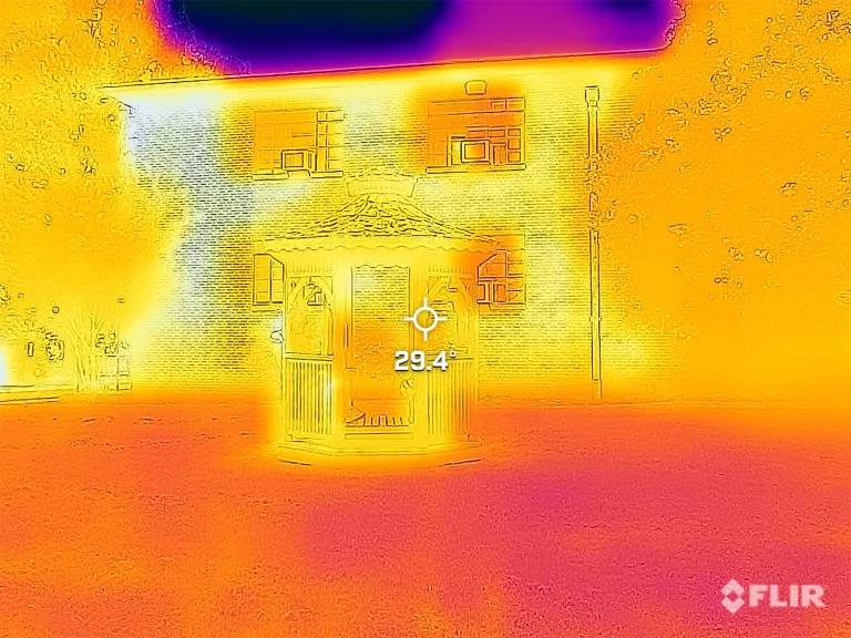
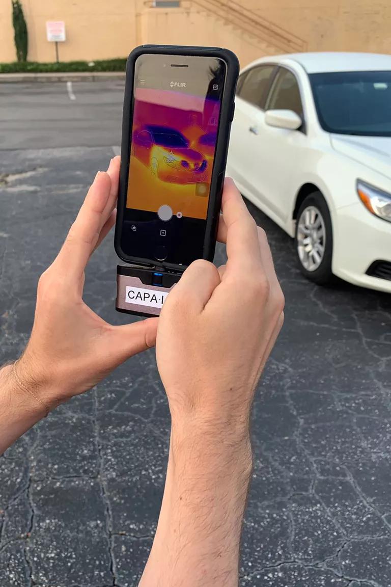
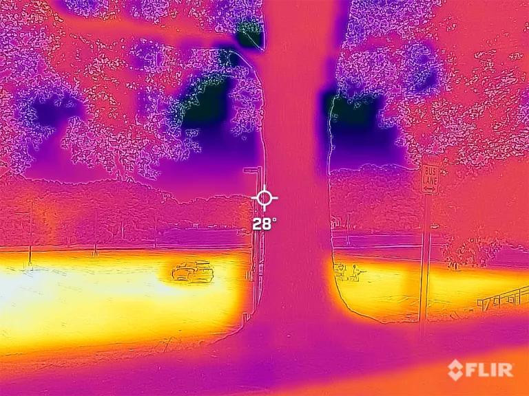
Clockwise from right: A volunteer uses a mobile phone as a thermal camera in North Carolina; screen captures from FLIR heat cameras showcase the differences in temperature (in degrees Celsius) across North Carolina State University’s grassy and man-made spaces.
CAPA Heat Watch
; 2)CAPA Heat Watch
; 3)CAPA Heat Watch
How data collection works
The mapping work is carried out in largely the same way across all the cities and is a team effort from start to finish. First, volunteers—who range from retirees to graduate students to local city council members—are recruited and trained by CAPA Strategies, in coordination with local nonprofits, universities, and neighborhood associations, on how to use heat and humidity sensors. CAPA also works with residents to include specific areas of interest, like public transit hubs, schools, or high-vulnerability census tracts along the routes that volunteers will traverse. “We went directly to community-based organizations and asked them, ‘Which parts of town are most important to measure?’” Cawley says. “Residents are the most knowledgeable about their own backyards and the way infrastructure has shaped their lives.”
Then, on a single day with just the right local forecast (high temps and clear skies, ideally), volunteers in each city head out during early morning, afternoon, and evening shifts to collect the data.
Afterward, CAPA Strategies uses advanced computer modeling to analyze the results alongside satellite imagery and create detailed maps that give a more complete picture of a city’s heat variability.
The takeaways proved illuminating. In Raleigh and Durham, for example, the researchers learned that forested parks help temper heat in adjacent residential areas, not just within the parks themselves. Meanwhile, vegetative buffers, like a border of trees surrounding a parking lot, can lower temperatures in areas that abut such concrete-laden hot spots.
“One of the things that’s so cool about this project is that it’s hyperlocal data to inform hyperlocal interventions,” Monteblanco says.
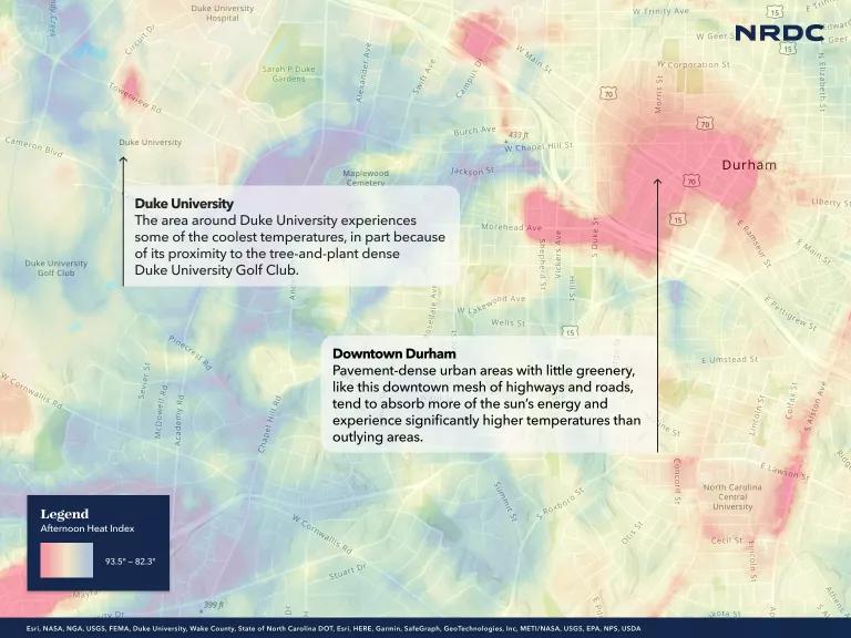
Temperatures differences between neighborhoods in Durham, North Carolina
How cities use urban heat island data
In North Carolina alone, the mapping campaign has since informed a pilot initiative to treat roadways in the hottest Raleigh neighborhoods with an innovative reflective coating that can reduce air temperature by 7 degrees Fahrenheit. Raleigh City Council, which funded the project, cited the data gathered by community scientists as the impetus behind the pilot initiative and the basis for deciding where interventions would be most necessary.
Durham public schools have worked alongside other local partners to create a curriculum for the upcoming school year that expands on the campaign and allows middle and high school students to look at heat data on their own campuses. And health-care facilities across the state have also started using the data to support patient education efforts. Dr. Jennifer Lawson, a clinical associate in the department of pediatrics at Duke University and a volunteer with the campaign, notes that the data helped make the risks more tangible to physicians and patients alike. “A 10-degree heat differential—that’s something that can stick with someone,” she says.
This summer’s participating cities also have plans to put the data to good use. In Oklahoma City, the maps may inform an effort to reduce minimum parking requirements for developers, which would cut down on heat-absorbing pavement. And in Asheville, North Carolina, the data will help shape a forthcoming urban forestry master plan. “When we receive our heat data back, we'll know exactly which neighborhoods are the hottest, which will tell us where we need to add trees but also where it's imperative we protect the trees that are already there,” says Nicole McNeill, a communications manager with the Asheville-based environmental nonprofit Greenworks, a partner on the campaign.
Importantly, the campaign has also come to serve as an immersive public health effort. “This is more than just one day of data collection but, in fact, an opportunity to educate and empower people to stay safe,” Monteblanco says. During their training, program coordinators covered signs of heat illness, as well as stats on hospitalizations and death from heat stress. It’s information that’s already helped save lives.
Now, Monteblanco hopes that the ripple continues to reach more widely into communities. “Even if people aren’t doing the actual heat mapping,” she says, “I’m hoping that our outreach means that on campaign day, if you see someone with a sensor driving through your neighborhood, you know that they are collecting heat data to help keep us safe.”
Want the Urban Heat Island mapping campaign to come to your city? Learn more from NOAA on how to apply for funding.
This NRDC.org story is available for online republication by news media outlets or nonprofits under these conditions: The writer(s) must be credited with a byline; you must note prominently that the story was originally published by NRDC.org and link to the original; the story cannot be edited (beyond simple things such as grammar); you can’t resell the story in any form or grant republishing rights to other outlets; you can’t republish our material wholesale or automatically—you need to select stories individually; you can’t republish the photos or graphics on our site without specific permission; you should drop us a note to let us know when you’ve used one of our stories.
We need climate action to be a top priority in Washington.
Tell President Biden and Congress to slash climate pollution and reduce our dependence on fossil fuels.
What Is Climate Gentrification?
How Long Does It Take to Get a FEMA Buyout for a Flooded Home?
Climate Tipping Points Are Closer Than Once Thought