
The Power of Measurement, Part I: The State of Freshwater Inflow to the San Francisco Bay Estuary
I believe in the power of measurement.
Since I’m a scientist, I suppose this is to be expected. Measurements are a way to answer questions, spot patterns, and connect the dots. They make you think and, at least for some people, they can even persuade you to change your mind or your behavior. For me, half of the fun of being a scientist is figuring out how to measure the piece of the puzzle that I need to understand how something works.
For the past ten years, starting with the Ecological Scorecard project and its successor, the 2011 State of the Bay report, I’ve been using measurements to track and evaluate the ecological health of San Francisco Bay, the West Coast’s largest estuary and my own backyard. But these measurements, or indicators as we call them, aren’t just for show. They are also powerful tools to help us understand how this threatened estuary—and the valuable ecological, commercial and recreational services it provides—is responding to our management, protection and restoration efforts.
Estuarine ecosystems—dynamic and rich habitats where rivers meet the ocean—are defined and driven by the amounts, patterns and timing of their river inflows. Thus, for an estuary, freshwater inflow is one of the most interesting things to measure and a useful indicator of physical processes and habitat conditions. In the San Francisco Bay, inflow is also a good predictor of fish abundance—more inflow corresponds to more fish.
The Bay receives fresh water from dozens of rivers but its largest tributaries are dammed and, each year, much of their flow is stored in reservoirs or diverted for agricultural, industrial and urban use. Thus, the amount of fresh water that reaches the estuary has been reduced. The indicators I developed measured what percentage of the flow from the Bay’s main watershed, the Sacramento-San Joaquin, actually reached the estuary each year and how frequently did the estuary experience critically low inflows, or drought conditions, whether natural or man-made. (For more information on the indicator measurements, see here.)
Here’s what I found.
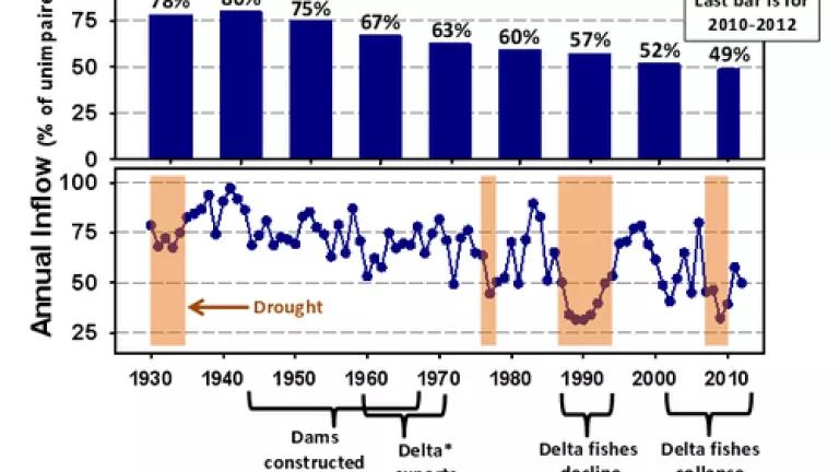
This graph shows the amount of freshwater inflow to the estuary for the 1930-2012 period, expressed as the percentage of estimated unimpaired inflow. Unimpaired inflow is the amount of fresh water that would have flowed into the Bay if there were no dams or water diversions. The top panel presents the indicator results as decadal averages; the bottom shows results for each year, along with information on the timing of droughts, dam and water diversion construction, and fish population declines.
The main thing this indicator shows is that the amount of fresh water reaching the Bay has declined from around 80% of the unimpaired runoff before the dams were built to less than 50% in recent years. The increasing amounts of water diverted over time reflect the progressive development of water management facilities from the early 1940s to the 1970s, when most of the dams and diversions were completed and became fully operational. The year-to-year variations in inflow reflect differences in annual precipitation, California’s characteristic mix of wet and dry years: in wet years, a greater percentage of the watershed’s runoff reaches the Bay than in dry years. Delta fishes, which are affected by flow and many other factors, have consistently experienced substantial population declines during periods with multiple years of low inflows.
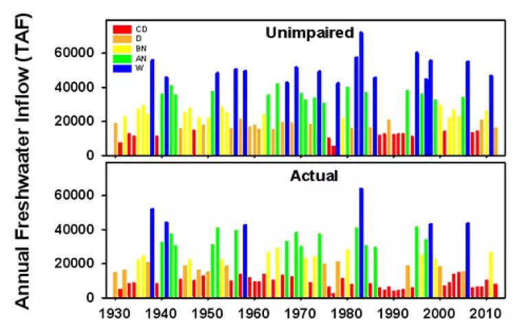
This second indicator compares the frequency of dry years in the Bay’s watershed, shown as unimpaired inflows (top panel) and actual freshwater inflows to the estuary (bottom panel). Starting with the top panel, the bars are color coded, with red for the driest 20% of years (“critically dry” with annual unimpaired inflows less than 15,000 thousand acre feet [TAF]), blue for the wettest 20% of years (“wet” with more than 42,000 TAF), and orange, yellow and green to indicate the intermediate quintiles for “dry,” “below normal” and “above normal,” respectively. In the bottom panel showing the amount of fresh water that actually reached the Bay each year, the bars are colored red for years with less than 15,000 TAF, blue for years with more than 42,000 TAF, and the orange, yellow and green for the intermediate flow amounts.
The red bars in the “Actual” panel tell the story of an estuary experiencing chronic drought conditions. The majority of the drought years are man-made, the consequence of the continuously increasing water diversions. For example, during the past 20 years, even though only four years (20% of years) were naturally critically dry in the watershed (the red bars in the unimpaired graph), the estuary received low inflows, less than 15,000 TAF, in 10 years (50% of years). The last decade has been even worse: diversion of water increased the frequency of critically low inflows by 250%, from two out of 10 years of natural drought to seven out 10 years, creating five additional years of man-made drought for the estuary.
Reduced freshwater inflow to the Bay has been recognized as an ecological and water quality problem since the 1970s (see here for a fascinating historical review). But these indicators—not to mention the collapsing fish populations—tell us that this problem is getting worse, not better. Shouldn’t we be doing a better job using measurements like these to inform and guide our planning and management for this valuable ecosystem?
In my next post, I’ll use the indicators to examine whether the proposed Bay Delta Conservation Plan will help to address this problem.