
Last week I wrote about a new analysis by NRDC, The Sierra Club and League of Conservation Voters of gasoline use across the country, specifically comparing counties to one another to determine which are sponging up most gasoline and therefore literally driving our oil addiction.
There was considerable interest in a map of national gasoline use per capita. We didn’t publish that because of a couple of drawbacks that I discussed with Tanya Snyder of streetsblog. First, it overemphasizes the role of rural and exurban counties, where gasoline use per person may be high but contribute little to the nation’s overall oil use. Second, it’s clear that some of those counties stand out because of through-traffic, not driving generated by the often-modest number of residents there.
With these caveats, we now present the new map (courtesy of NRDC’s map expert Rachel Fried) showing distinctions between counties based on gasoline consumption per capita:
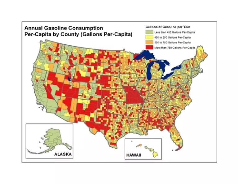
Counties that jump out can be found especially in the northern plains, the southwest and southeast. We do need to be cautious here, since the data may be poorly reported or otherwise faulty as we thought it might be for St. Louis County individually and likely for the entire state of Missouri. Overall, these are the places with relatively low population and therefore not the biggest drivers of absolute gasoline use even though each person is doing more driving to meet their daily needs.
We also have a new version of last week’s map. In that map, we looked at gasoline consumption based on last year’s national average fuel economy standard. However, there’s a difference between the test-value standard and the on-road standard plus there’s a lag time between the application of that standard and what happens on our roads. Consequently while the relationships between counties were well-reflected in that map, the overall gasoline consumption numbers are actually higher when we went back and used a more accurate estimate of the national average miles-per-gallon of the fleet of vehicles on the road today. Here is a new map reflecting that reality:
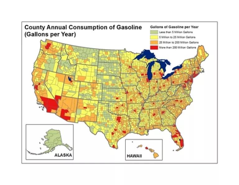
The biggest difference is an increase in the number of counties moving up to “yellow” status. And interestingly, both maps are probably more accurate for different parts of the country. This one probably overestimates consumption by counties with fleets that are more fuel-efficient such as those in California. And last week’s probably underestimates consumption in counties with less efficient fleets. What would really be useful for painting an even more accurate picture would be if states and counties tracked and published fuel-efficiency data for registered vehicles!
And thankfully the whole picture will get rosier as the fuel economy of vehicles on the roads improves thanks to the new standards the Obama administration has put in place.
The most interesting thing we can do is to combine these two approaches—looking at counties with the highest annual oil consumption with per capita consumption -- in order to identify the greatest opportunities for reducing oil addiction. For that purpose we have created a new table below. This table takes the top 50 counties for annual gasoline consumption and then ranks these based on per capita gas-guzzling. Here’s that ranking:
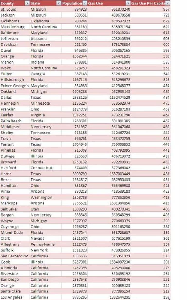
California ends up looking pretty good in this ranking. High absolute consumption numbers command attention – and thankfully NRDC’s Amanda Eaken is working with allies there to transform California’s transportation future for the better – and it’s clear that other counties have much higher per capita consumption levels.
Based on the results, and the response to them, NRDC will continue working with LCV and Sierra Club to analyze oil addiction geographically in order to determine the most compelling opportunities for reducing it. I hope you’ll stay tuned!
Related Blogs

BLM Finalizes Oil and Gas Rule

Southeast at a Crossroads: Bad Gas Bet or Clean Energy Boon?
